


 Salesforce ERP
 ERP + CRM Platform
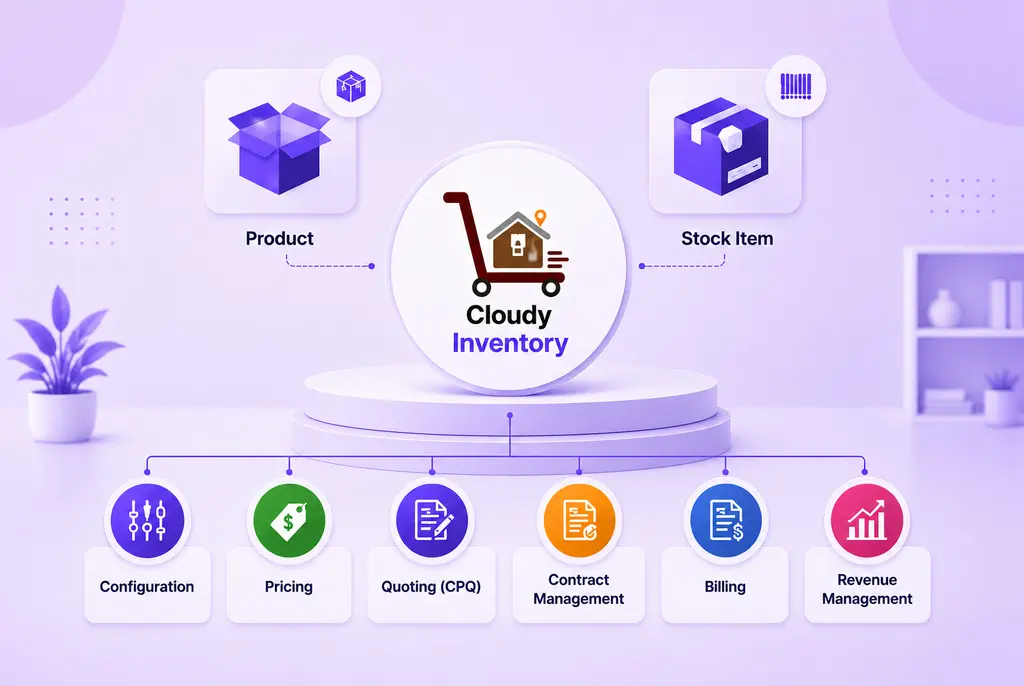
  Inventory Management
  Warehouse Management
  Order Management
  Vendor Management
  Logistics Management
  BOM Management
  Order Fulfillment
  Business Operations
  SaaS Platform for Operations
  Salesforce Cloud ERP Platform
  Xero
Xero
 Zoho books
 Quickbooks
 Shopify
 Acumatica
 SAP
SAP
 Odoo
Odoo
 NetSuite
 Microsoft Dynamics 365
 Sage
Sage


 Agentforce Revenue Management
 Agentforce Revenue Management + Billing
  Salesforce CPQ
 Salesforce Advanced Billing
  Migrate from CPQ to Agentforce Revenue Management
  Microsoft
 Data Cloud
 Tableau
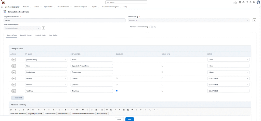
 Related List
This is a section type used to display data from child objects related to the target object. For example: Displaying all Quote Line Items on a Quote document, Listing all Opportunity Products on an Opportunity.
- Select Related Object → Here, you choose the target object’s child object whose records you want to display as a table. E.g., Opportunity Products of an Opportunity. If an object is selected then only the configured fields are editable.
- Advanced Customization → Provides full creative freedom to design your own template.
- Apply Filters on Records → Filter the related records that appear in the table based on specific criteria.
- Configured Fields
To configure the fields you need to select the related object.
Object and Fields
Defines which data appears in the table (the columns). You can add fields from the selected related objects to display them in the generated document.
| Fields | Description |
| Action | Allows you to delete a field or drag and drop rows to change their order. |
| API Name | Displays the unique API name of the selected field. |
| Display Label | Specifies the column header text shown on the document. You can also provide a custom label name. |
| Summary | Calculates totals or counts for numeric fields (for example, the sum of all line item totals). |
| Merge Rows | Combines multiple columns into a single row for better layout control. |
| Action (Format Settings) | Allows users to change date and number formats based on available options. |
Layout & Format
The Layout & Format section provides precise control over the visual structure and appearance of the related list table within your generated document. It allows you to style tables, adjust borders, define record limits, and customize the table title to ensure consistent branding and readability.
Table Style
Applies a predefined set of formatting options to quickly style your table. Available styles include Bordered and Borderless.
- Table Border Style → Defines the overall border scheme for the entire table.
- Border Width → Sets the thickness of the table’s borders. This setting is required if a border style is selected.
- Border Color → Defines the color for the table borders.
- Apply Outer Border Table → Applies borders only to the outer edges of the table, leaving internal cell borders unstyled.
Max Records
Limits the number of rows (child records) displayed in the table. This helps prevent the table from extending across multiple pages or displaying unnecessary data.
Display Related List Title
Controls the visibility of the table title. The availability of Related List Title, Title Size, Title Alignment, and Font Color options depends on this setting — these options appear only when Display Related List Title is enabled.
- Related List Title → Specifies the title text for the related list table.
- Title Size → Defines the font size of the related list title.
- Title Alignment → Sets the alignment of the title text (Left, Center, or Right).
- Font Color → Determines the color of the title text.
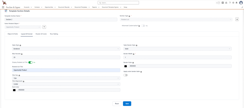

Note: The options Table Border Style, Border Width, Border Color, and Apply Outer Border Table appear only when the Bordered table style is selected.
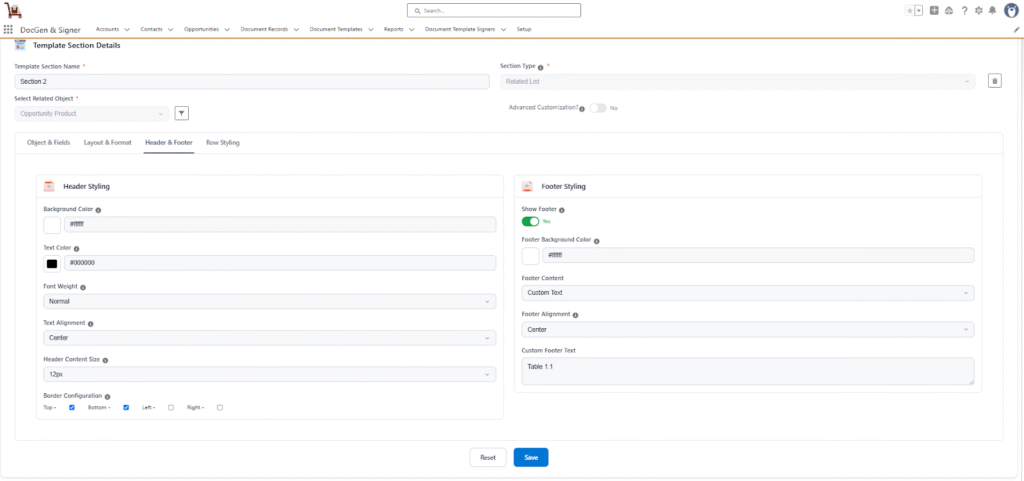
Header & Footer Settings
The Header & Footer section controls the visual appearance and styling of the document’s header and footer rows. These settings help ensure a consistent and professional look across generated documents.
Header Styling
- Background Color → Sets the background color of the header row. Commonly used for branding or to visually distinguish the header from the table data.
- Text Color → Defines the color of the text displayed within the header row.
- Font Weight → Determines the thickness of the header text. Options include Normal and Bold.
- Text Alignment → Controls the alignment of the header text. Available options include Left, Center, and Right.
- Header Content Size → Sets the font size of the header text to improve readability and layout consistency.
- Border Configuration → Allows users to apply borders to the header section. Borders can be applied individually to the top, bottom, left, or right sides of the header.
Footer Styling
- Show Footer → Toggles the visibility of the footer section in the document.
- Footer Background Color → Sets the background color of the footer, maintaining visual harmony with the header or table design.
- Footer Content → Enables adding custom footer content such as notes, disclaimers, or additional information.
- Custom Footer Text → Defines the specific text content to be displayed in the document’s footer section.
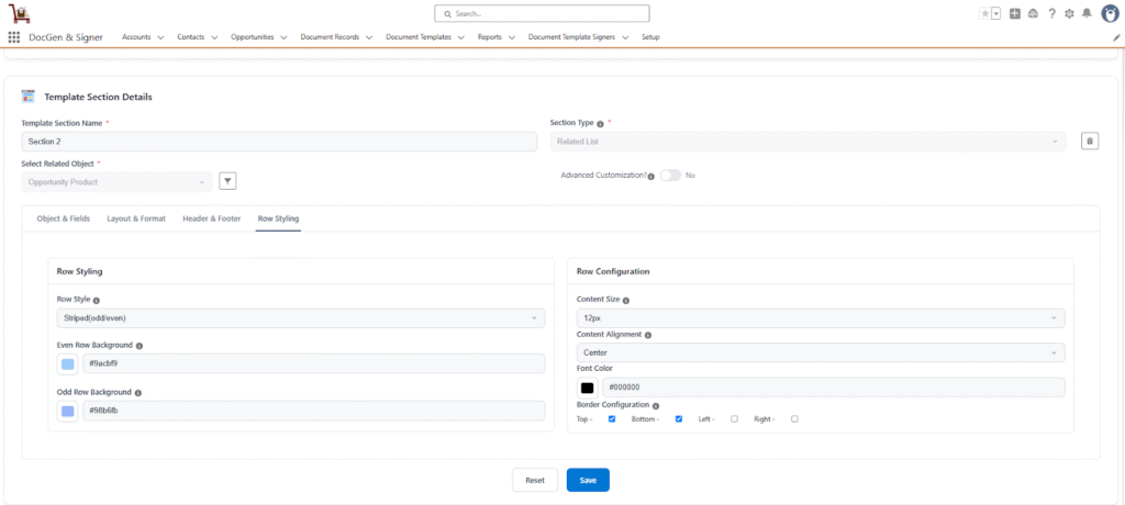
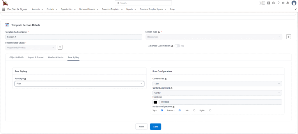
Row Styling
The Row Styling settings determine the visual appearance and formatting of all rows within the table. These options allow users to customize how each row appears, ensuring clear readability and a consistent design across the document.
Row Configuration
- Row Style → Defines the visual pattern applied to table rows.
- Available options:
- Plain – All rows share the same background.
- Striped (Odd/Even) – Alternates row background colors for better visual distinction.
- Available options:
- Even Row Background → Sets the background color for even-numbered rows (e.g., 2nd, 4th, 6th, etc.).
- Odd Row Background → Sets the background color for odd-numbered rows (e.g., 1st, 3rd, 5th, etc.).
- Content Size → Defines the font size used for table content to improve readability.
- Content Alignment → Controls how text is aligned within each cell of the table rows.
- Available options: Left, Center, Right.
- Font Color → Specifies the color of the text within table rows, allowing customization to match brand or document themes.
- Border Configuration → Enables users to apply borders to the table rows.
Borders can be individually applied to the top, bottom, left, or right sides for enhanced visual separation.
Note: The Even Row Background and Odd Row Background options appear only when Striped (Odd/Even) is selected.
Odd Even
Plain
- Save → Saves and applies all configured settings in this section to the document content.
- Reset → Discards all unsaved changes made in this section and reverts the settings to their last saved state.
Note: If the user adds only the top and bottom borders to the header, the left and right borders of the cells may overlap. And when you remove all borders from the header and keep only the left and right borders for the cells, the left and right borders still overlap.
In the Related List section type has the Advanced customization.
 SEE ALSO :
____👉 Advanced Customization
____👉 Canvas