


 Theme
Theme
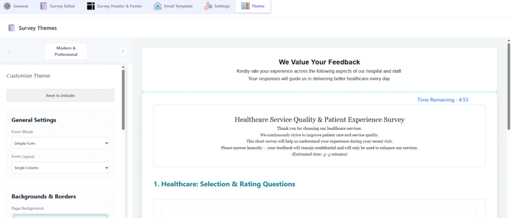
The Survey Theme is the core design template that governs the overall look, feel, and presentation of the survey form. It provides a quick way to apply a cohesive, branded, or professional style without manually adjusting every individual setting.
General Visual Controls
- Survey Themes: The base visual style of the survey, selectable from a list of options (e.g., “Modern & Professional”).
- Reset to Defaults: A quick action to clear all custom styling and revert to the theme’s original appearance.
- Form Mode: Defines the basic behavior of the survey form (e.g., “Simple Form”).
- Form Layout: Controls the arrangement of questions on the page (e.g., “Two Columns” to place questions side-by-side).
Backgrounds and Borders
- Page Background: The color applied to the entire screen or page behind the main survey form.
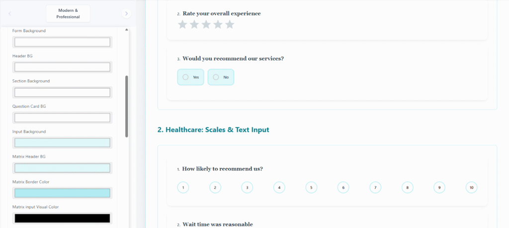
- Form Background: The color applied to the main container or card holding the entire survey’s content.
- Question Card BG: The background color for the individual card that frames each question.
- Input Background: The background color of fields where a user types or selects a value (e.g., text boxes).
- Matrix Header BG: The background color for the top row or column headers in a Matrix/Grid question type.
- Matrix Border Color: The color of the separating lines within a Matrix question table.
- Matrix input Visual Color: The color used for visual elements or selections within the Matrix input area.
Typography and Color Palette
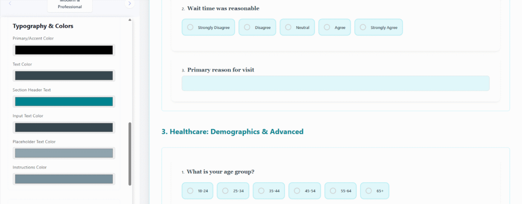
- Primary/Accent Color: The main highlight color used for active elements, buttons, links, and selection indicators.
- Text Color: The default color for general body text and question labels.
- Section Header Text: The specific color for titles used to introduce sections within the survey.
- Input Text Color: The color of the text a respondent enters into a field.
- Placeholder Text Color: The color of the hint text that appears in empty input fields.
- Instructions Color: The color for supplementary text that provides additional guidance or context.
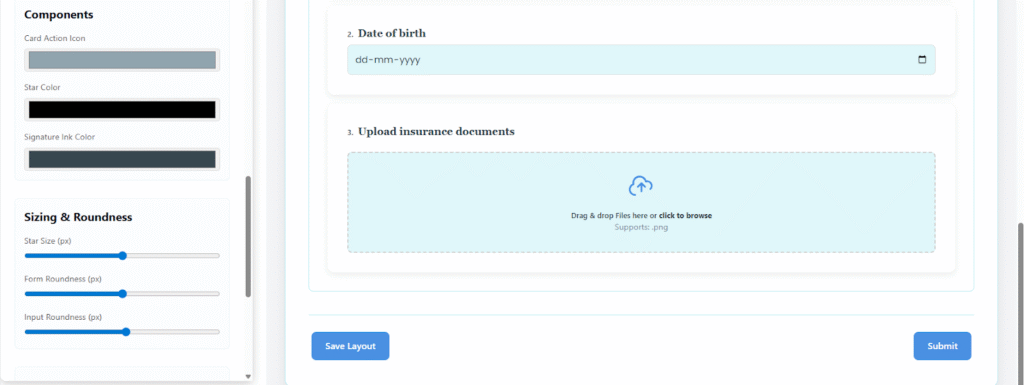
Component Appearance and Sizing
- Card Action Icon: The color for small icons used for actions or quick edits on question cards.
- Star Color: The color of the star icons used in rating-scale questions.
- Signature Ink Color: The color of the “ink” when a respondent uses a digital signature field.
- Star Size (px): A numerical value (in pixels) controlling the size of the rating stars.
- Form Roundness (px): A numerical value (in pixels) controlling the corner radius of the main form container.
- Input Roundness (px): A numerical value (in pixels) controlling the corner radius of input fields.
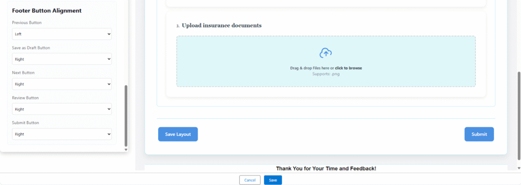
Footer Button Alignment
- Previous Button: Horizontal alignment (Left/Right) of the button that navigates backward.
- Save as Draft Button: Horizontal alignment of the button to save partial progress.
- Next Button: Horizontal alignment of the button that navigates forward.
- Review Button: Horizontal alignment of the button that shows a summary before submission.
- Submit Button: Horizontal alignment of the final submission button.